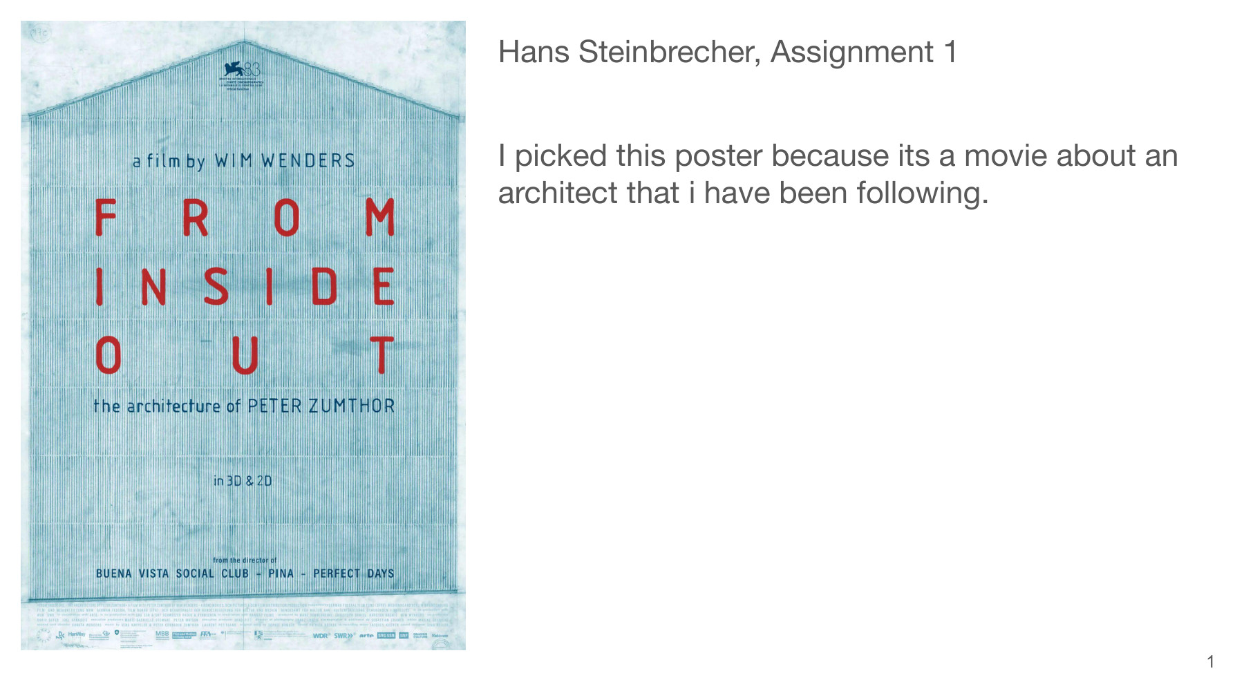
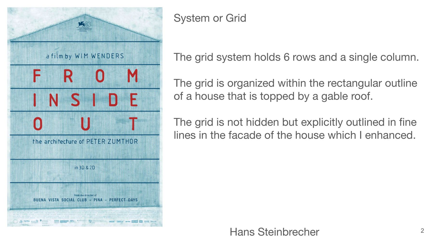
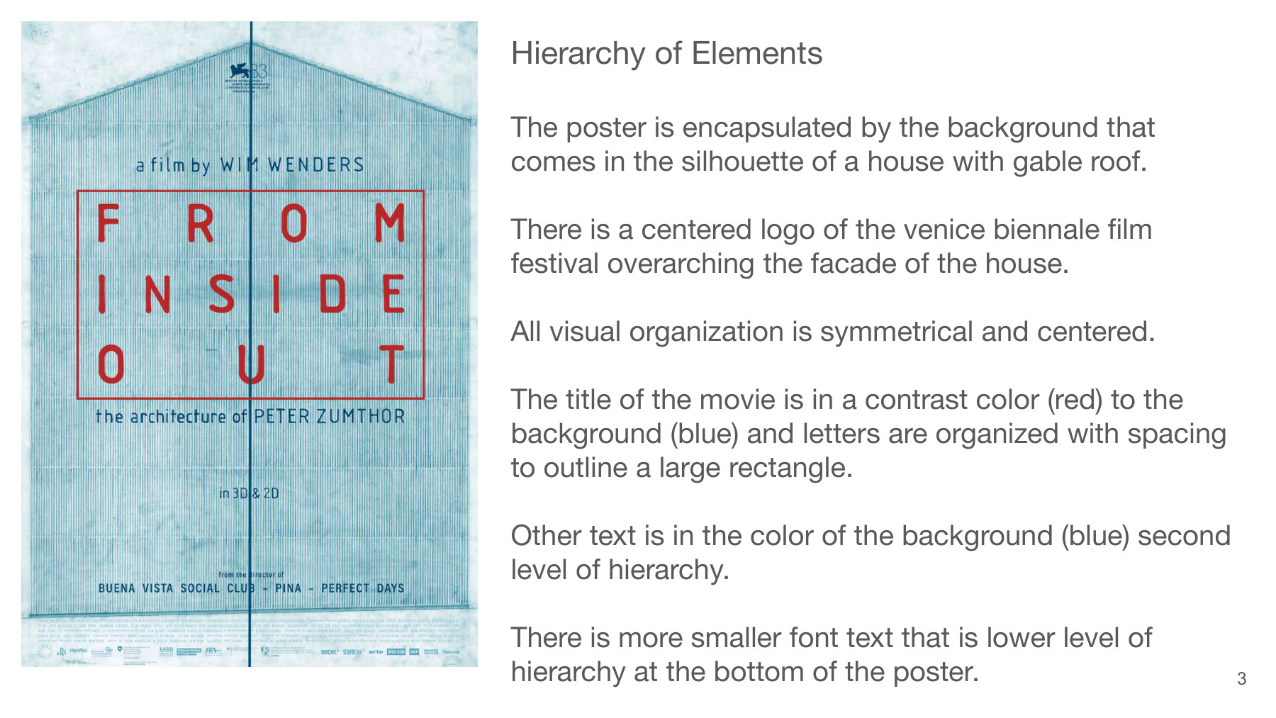
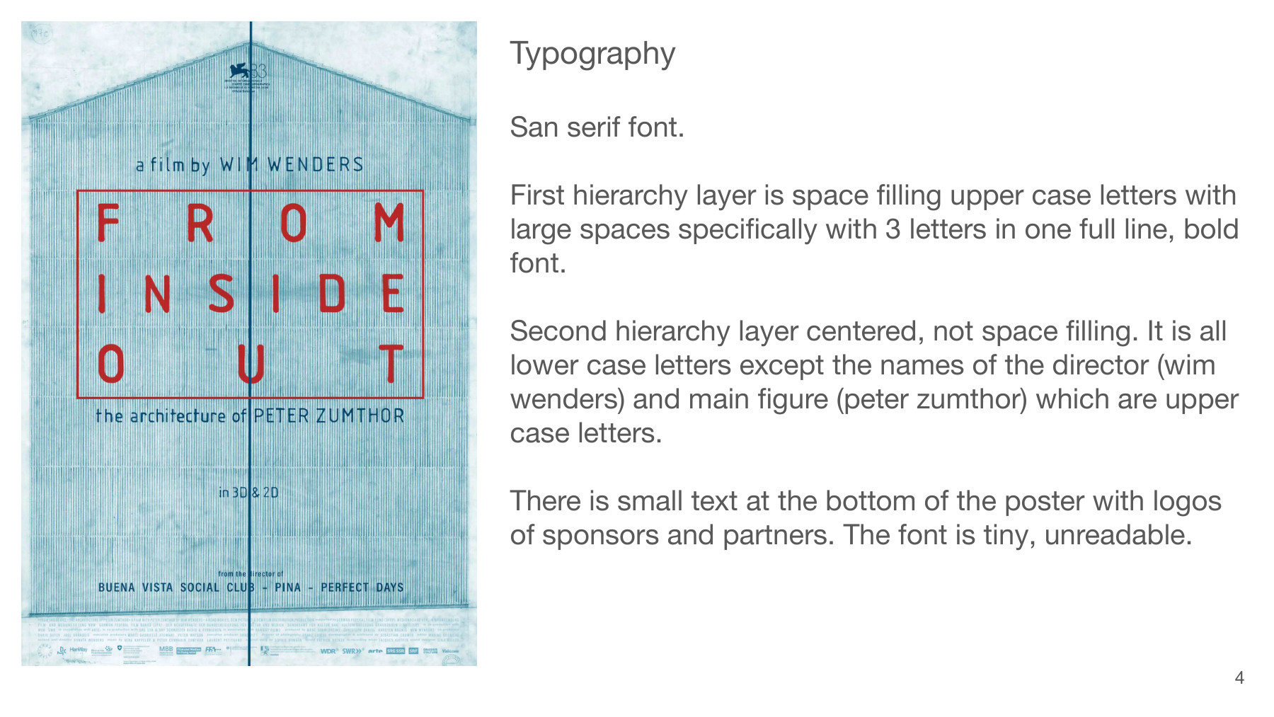
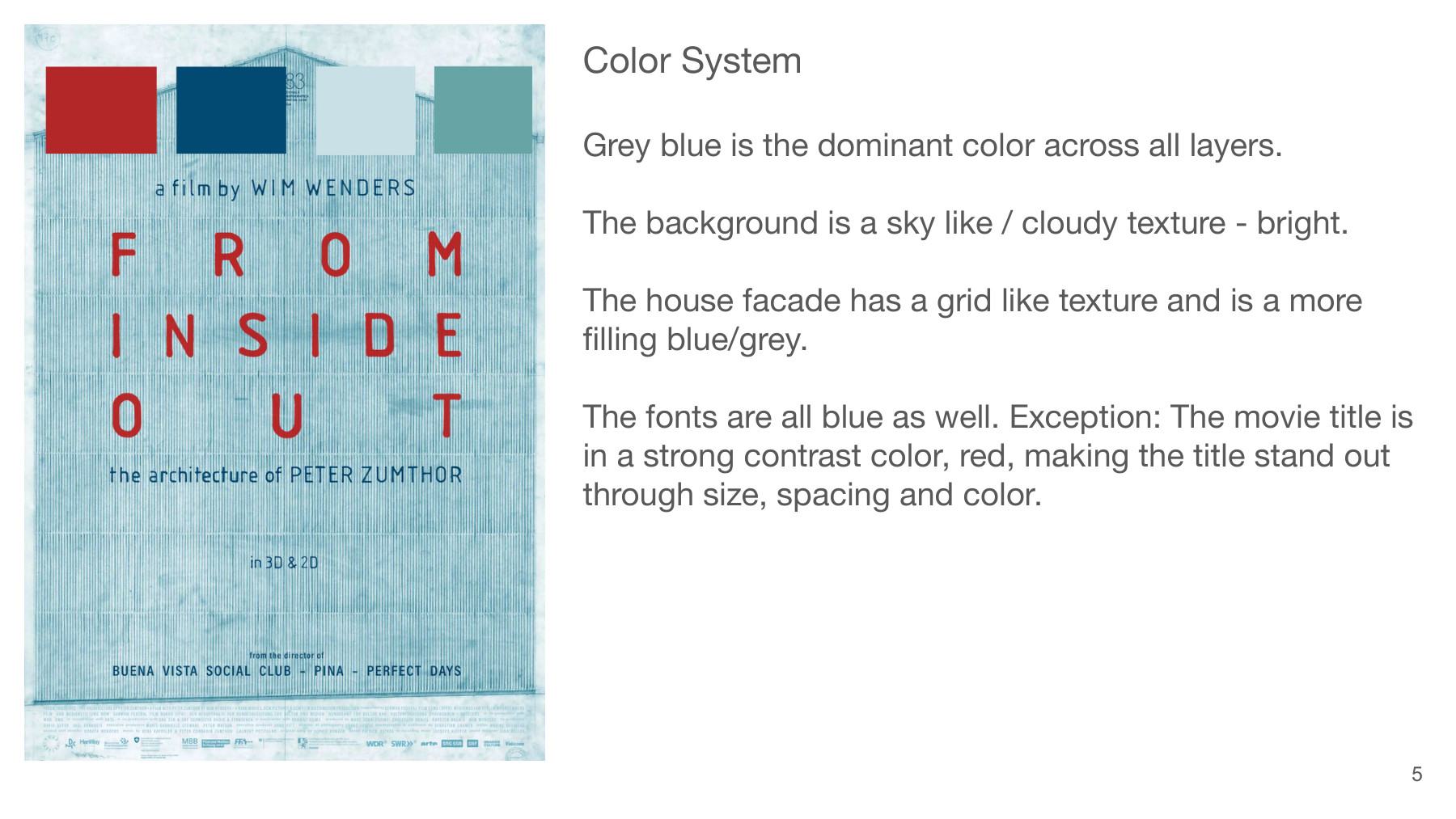
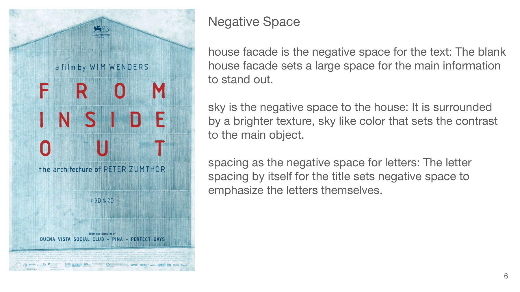
This post analyzes a movie poster through five graphic approaches: its system or grid, hierarchy of visual elements, typography, color system, and negative space. It considers how the design grabs attention, sparks interest, creates desire, and leads to action.
A mood board and reflection explore my visual preferences and the experiences behind them. Related reading and listening: “Good Taste Is a Myth” (Fast Company) and “How Social Media Algorithms ‘Flatten’ Our Culture by Making Decisions for Us” (NPR).
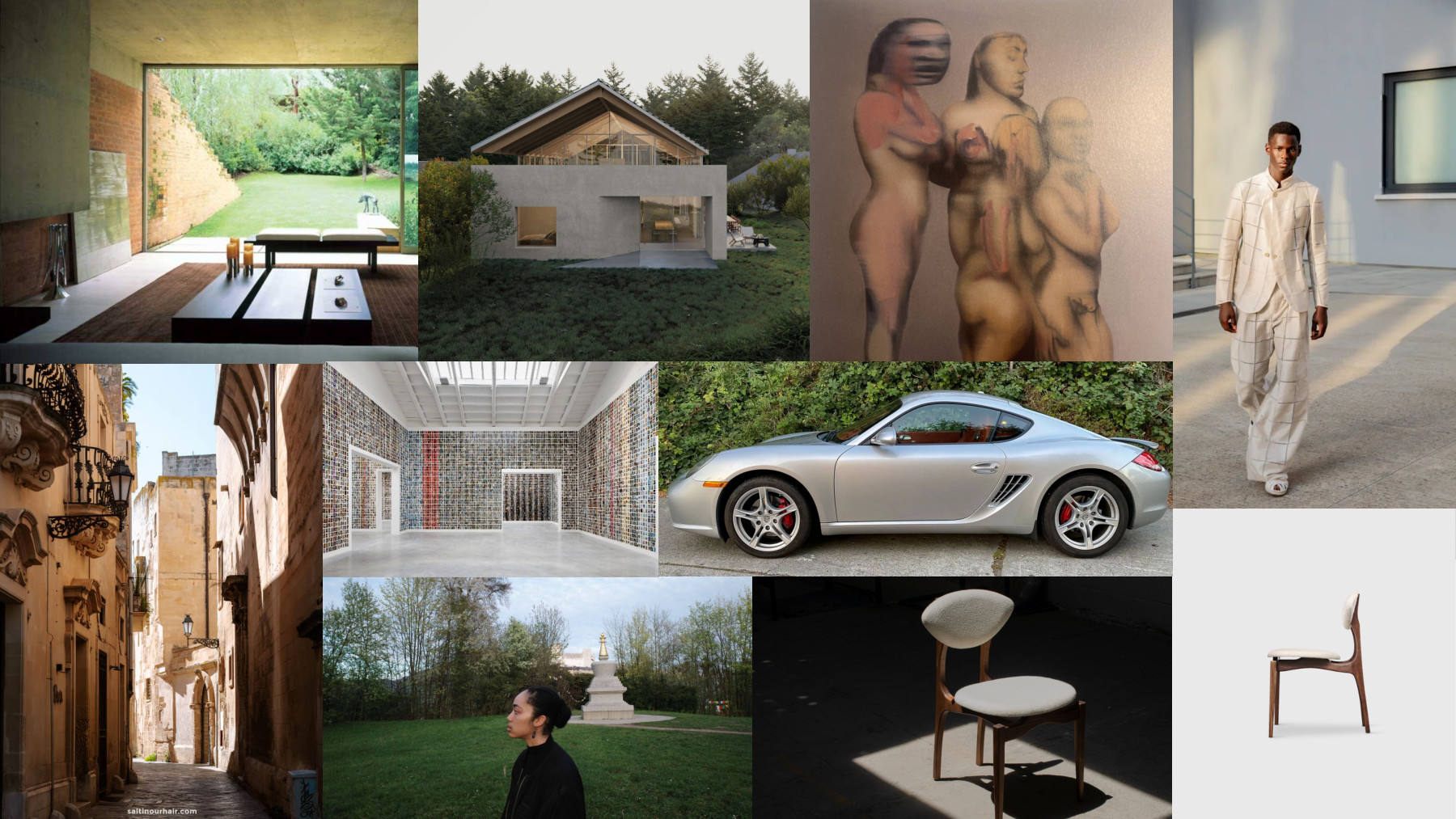
I selected these images because they mix clear, abstract forms with natural materials and green landscapes. The first image shows a house by Alberto Kalach. I like the clearly designed lines together with red stone and green landscape. The second picture shows a rendering of a house that I am working on in the alpine landscape of Salzburg: well-defined lines, a spruce roof, and green landscape.
George Rouy's paintings have something similar for me: organic body shapes mixed with surreal elements, abstracted and yet with a natural feel. Emporio Armani has clean, elegant cuts, but leaves the expression to the human. The Italian city of Lecce has organic colors and materials that have developed through a long time of wear, a perfect stage for expression and yet designed infrastructure.
The Spanish Pavilion in Venice felt airy and wide this year. A mosaic of photos on the walls gave the hall a cheerful color theme. The atmosphere supported the way I like to be in this world.
The picture of my friend in Salzburg brings together abstract shapes, a person, and green landscape. The last picture is a chair that I have at home. It is a walnut wood object with comfortable material to sit on. It looks abstract and yet offers a very natural posture to sit in.
My taste is derived from Herman Hesse’s idea that beauty carries its reward in itself, increasing our sense of life and self-confidence, making us more cheerful and happier and giving us a higher sense of safety and health. I selected these pictures because I like green landscapes and abstract forms/shapes. Places that have four seasons, where transition happens and the setting is powerful. Where nature is undeniably the strongest force. I enjoy when well defined shapes are placed in my natural habitat and I love colors that blend in to the landscapes that have formed their color scheme naturally. Clear shapes, visually silent, warm. I love well defined and simple shapes that have a light cheerful tone through color selection. I love when light is indirect and break up into many tones of the original color. I love when the design of houses, furniture, cars or clothes support a confident and cheerful posture of being in this world, when they shape a platform for my life but stay in the background to leave space for my expression. I like natural materials, ingredients that give shape through clearly designed lines that set a posture but leave the expression to the human thats walking on them. I love being playful on top of an spiritual aesthetic, like old catholic symbols, brought back to contemporary life.