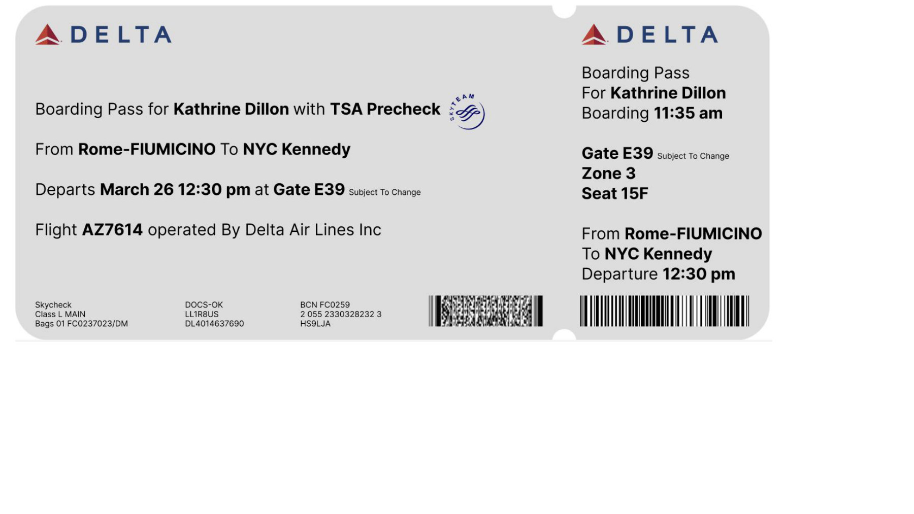
This post explores typography and information hierarchy through an airline ticket redesign for letter-size paper, using a range of type sizes and formatting.
The reflection below responds to Season 2, Episode 6 of Abstract: The Art of Design, “Jonathan Hoefler: Typeface Design.” Alternative viewing link.
Interesting how Font Design became a profession. How it is a foundational layer of design, below the information architecture and content design. Like a different way of Full Stack Engineering: Full Stack Design. It reminds me of an engineering challenge in the way it combines strokes to.create a functional composition on a limited amount of space. Really would love to learn more about the math behind the letter designs and selection of curve radius, thickness of strokes and type of serifs added. I am sure there are important observations about these that can be shared. I wish a designer would share more about this instead of the story telling on how they got picked up by a famous magazine. I love how they start designing the type face with letters H O. One letter with only straight lines and one letter only curves. And how they find letters to associate with each other "should we make the S more J-like"?
It is fascinating how letters were written in ways in previous centuries, that we can't even read today anymore. Like German, the language was generally written in Fraktur in the 19th century, a highly serif font. Today this is not just hard to read, but literally unreadable because many letters are not just designed differently but are different so that they are hard to recognize. My grandmas Goethe books were still in Fraktur and I was never able to read them.
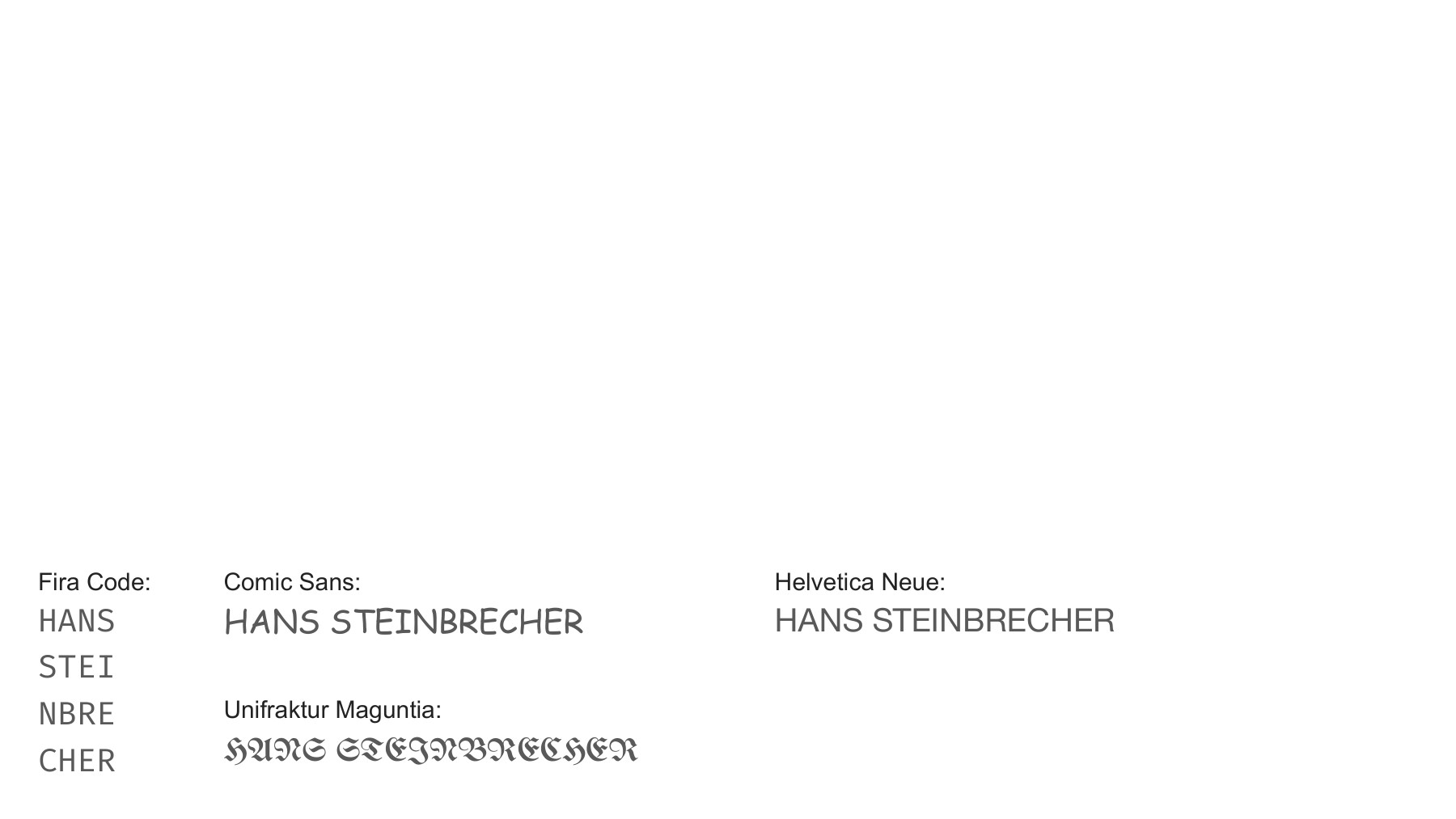
My name set in Fira Code, Comic Sans, Unifraktur Maguntia, and Helvetica Neue.